Global navigation
Boost content discovery, task completion
and brand perception with a mega-menu
We set out to improve how users navigate the CHOICE website with a new global nav.
Highlights:
Reduced average task completion time from 2 minutes to 10 seconds.
Significantly improving brand perception

Key achievements

As the lead UX designer:
Combined qualitative and quantitative research methods to inform the design
Delivered elegant information architecture solution within SEO and content management constraints
As acting product manager:
Led and supported the agile team
Prioritised product roadmap
Communicated effectively to the core team, key stakeholders, external agencies and the whole organisation
Problems
Having a shallow one-level navigation slowed users down from completing common tasks. It also makes it difficult for users to discover more interesting content.
Another problem was that the navigation can give the wrong brand impression. At a glance, most users thought they were on a shopping or a lifestyle site.
A well-designed nav can actually show a more complete view of a site. I saw the opportunity to use the nav to showcase CHOICE's uniqueness: a combination of product testing, investigative content and consumer advocacy.

Data analysis & content audit

How to tell where the navigation fell short? I turned to a year worth of Google Analytics data to find answers. I looked into search queries and popular pages to answer the following questions:
Are some categories more popular than others?
What is the most popular content type?
Would users look for one piece of content in more than one place?
Mega-nav concept
Having considered both user and business needs, I came up with a mega-nav that…
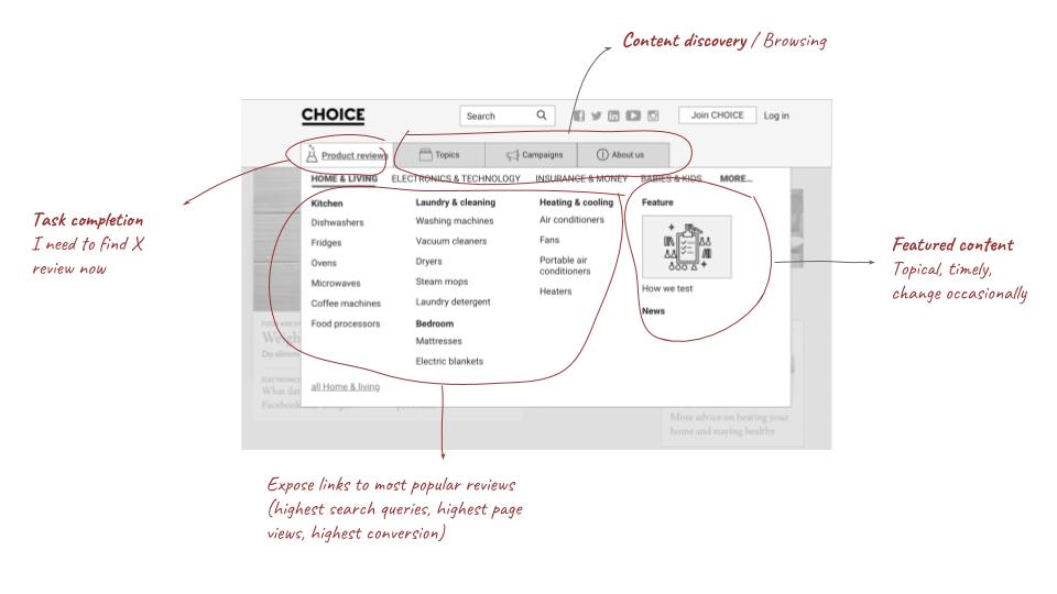
Directs users to the top converting and most sought-after reviews
Enables users to discover more content
Gives a clear picture of what CHOICE does and stand for
The data-informed design received positive feedback from all stakeholders and everyone in the company.
Quantitative testing

But will it actually make sense to end-users? I decided to use Treejack, the popular IA test tool to find the answer.
I came up with 40 realistic task-based scenarios to test whether the new structure will work with both members and non-members.
At the end of the test, we asked users to evaluate the brand impression they might have from purely looking at the tree structure.
Qualitative user testing

The task completion improved in the qualitative user testing session. We also get to hear what goes through user’s mind when they interact with the wireframe. We picked up a few small hiccups in interface and visual weights.
Treejack results shows that we get about 70% right with the new structure. Seeing where users expected to find the content helped me put them in more logical place. I realised some tasks’ wording were vague, leading to confusion and failure to complete. I made some changes to the structure, focusing on the 30% tasks that didn’t hit the mark and take it to in-person user testing.

Refine and build
By the build stage, I expanded my role in to product management as our product manager moved on to another role. Using both quantitative and qualitative data really paid off. We were confident in our approach. Being involved from the early stage, the core team believed in the solution and was keen to get started. The navigation is scheduled to be launched in a few weeks.