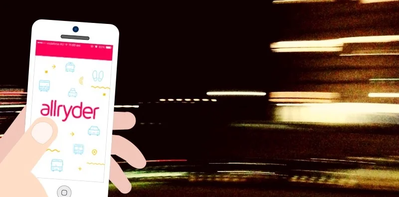
This week, as an exercise, I looked at allryder, an urban mobility app, with fresh, critical eyes. For those who are not familiar with the app, allryder lets you compare timetables, prices and durations for different routes and modes of transport. Wearing the two hats of UX designer, and commuter, I also did a quick redesign of the app and thought of new possibilities.
Dissecting the experience
The process is pretty simple and straightforward. Playing the role of a new resident of Berlin using the app to pick the best transport option to go from one point to another. I took notes on what was good, and what didn't hit the mark.
Disclaimer:
allryder is not available in Sydney, so I couldn’t use real-time data and have the full experience of the app.
The app in review was on an iPhone using iOS8.
Opinions and ideas in this post are purely by my own view and based on personal experience.
allryder, reimagined
I did a quick stab at redesigning the app, for the same scenario. Some screens changed radically, others not so much.
What do you think?
Future ideas
This is a bit of an unusual exercise for me. I’m often more comfortable working on a project after a fair bit of research. Maybe my surge of confidence comes from being a seasoned commuter in the city, and it’s something I personally care about.
Smartphone’s location service and urban transport apps have made life much easier for many of us. They saved us from randomly asking strangers, or the horror of getting off at the wrong stop. Studies also have shown that bus and train tracking have increased commuter’s satisfaction with the service, even though there was no actual improvement in the public transport itself.
But there are still so much possibilities when I thought about the commuter’s journey. While giving directions are focus of these apps, the experience within the trip is often overlooked. Here are some ideas I scribbled over on the weekend as future directions for a transport app:
Efficient transit
![[Courtesy of EPP NYC]](https://images.squarespace-cdn.com/content/v1/54ea31fee4b02db31b44b271/1426476261902-SMAHS3GKR3Z1K45KMC6B/Efficient-passenger-project.jpg)
[Courtesy of EPP NYC]
It took me a couple of months before I figure out that if I got on the third carriage of the train in Petersham, I could access the escalator immediately as I got off at Town Hall, and save 3 minutes of commuting. Wouldn't it be great if this type of info is available for everyone?
You may have heard of the Efficient Passenger Project in New York city, in Guerilla Public Service by 99 percent invisible. It's about a group of anonymous have installed signs to help commuters make the most efficient transfer.
Double as travel guide
While a lot of commuters use public transport everyday for work, there are a good number of tourists and out-of-towners. To change perception of ‘unproductive commuting time’, allryder can offer interesting facts and figures about a bus stop, train station or the area. The guide could also include other practical details like ticket counter, cloak services, toilet, wireless and power points.
Public transport bookclub
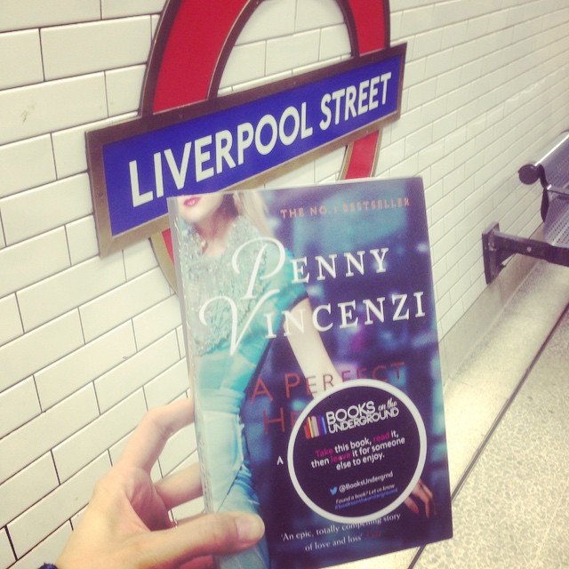
Courstesy of Books on the Underground
Here’s an excellent idea, Books on the underground, started by Hollie Belton at Leo Burnett London. Label your book with a sticker to mark that it is one of the Books on the Underground, you can turn the tubes into a giant mobile library system. What if we could use allryder to read book review, locate books or track their journey and connect people?